Visual Branding: How to Choose the Right Colour Palette for Your Brand


Choosing the right colour palette for your brand is critical in establishing a strong visual identity. Colours are powerful—they can influence emotions, perceptions, and even purchasing decisions. A well-chosen colour palette can make your brand memorable and set you apart. In this article, we’ll explore how to select the perfect colours that align with your brand’s personality and resonate with your target audience.
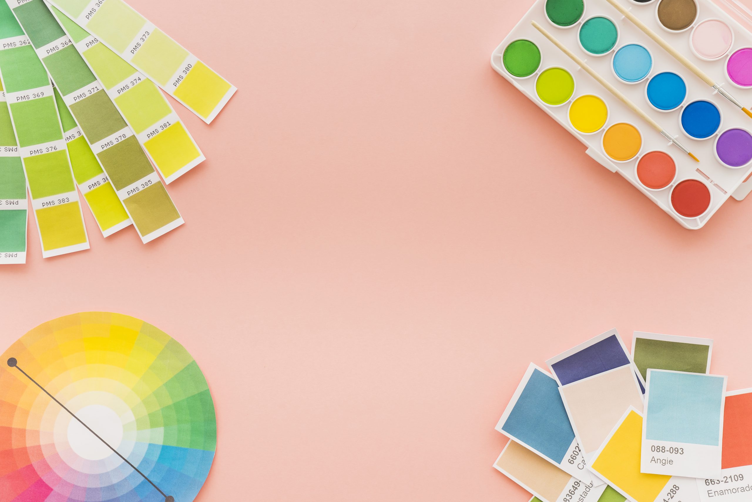
1. Understanding Colour Psychology
Colour psychology is the study of how colours affect human behaviour and emotions. In branding, colour psychology plays a vital role as different colours can evoke different feelings and associations. Here’s a quick overview:
- Red: Passion, excitement, and urgency. Think of brands like Coca-Cola and Target.
- Blue: Trust, calmness, and professionalism. Common in corporate logos like IBM and Facebook.
- Green: Growth, health, and tranquillity. Often used by brands like Whole Foods and Starbucks.
- Yellow: Happiness, optimism, and attention. Seen in brands like McDonald’s and IKEA.
- Black: Sophistication, elegance, and authority. Used by luxury brands like Chanel and Nike.
White: Simplicity, cleanliness, and purity. Think of Apple and Tesla.
Understanding these associations helps you choose colours that align with the emotions you want your brand to evoke.

2. Identifying Your Brand Personality
Your brand’s personality should guide your colour choices. Is your brand playful and fun, or is it serious and professional? Here’s how to define and reflect your brand’s personality through colour:
- Playful and Fun: Bright, vibrant colours like yellow and orange.
- Professional and Trustworthy: Muted, cool colours like blue and grey.
- Innovative and Modern: Bold, contrasting colours like black and white.
For example, Google’s playful personality is reflected in its multi-coloured logo, while IBM’s professionalism is embodied in its blue logo.
3. Researching Your Target Audience
Understanding your target audience is crucial in choosing the right colours. Different demographics can have varying colour preferences:
- Age: Younger audiences may prefer brighter, more vibrant colours, while older audiences might favour muted, classic colours.
- Gender: Some studies suggest women may prefer softer colours while men might lean towards bolder hues.
- Culture: Colours can have different meanings in different cultures. For instance, red symbolises good luck in China but can represent danger in other contexts.
Conduct surveys or use analytics to gather insights into your audience’s preferences to ensure your colour choices resonate with them.

4. Analyzing Competitors
Researching your competitors’ colour palettes helps you understand industry standards and identify opportunities to differentiate your brand. Look for common colour themes and consider how you can stand out with them while still fitting within your industry.
For instance, in the tech industry, many brands use blue to convey trust and reliability. Slack chose a colourful, unique logo that differentiates it from more traditional tech brands like Microsoft and IBM.
5. Creating a Colour Palette
A cohesive colour palette typically includes primary, secondary, and accent colours:
- Primary Colour: The main colour that represents your brand’s essence.
- Secondary Colours: Complementary colours that support the primary colour.
- Accent Colours: Used sparingly to highlight specific elements.
Tools like Adobe Colour, Coolors, and Paletton can help you create and test different colour combinations until you find the perfect palette.
6. Testing Your Colour Palette
Testing your colour choices in different contexts ensures they look good in all applications. Consider how your colours appear on digital screens, in print and on packaging. Gather feedback from focus groups or through A/B testing to refine your choices.

7. Ensuring Consistency
Maintaining colour consistency across all brand materials is essential for brand recognition. Create brand guidelines that specify colour codes and usage rules. Consistent use of colours in your logo, website, marketing materials, and products helps reinforce your brand identity.
Brands like Coca-Cola and McDonald’s are instantly recognisable partly because of their consistent use of colour across all touchpoints.
8. Case Studies
Examining successful brands can provide inspiration and insights:
- Coca-Cola: Uses red to evoke excitement and passion.
- Tiffany & Co.: The distinctive “Tiffany Blue” symbolises luxury and sophistication.
- Spotify: The green logo reflects growth and creativity, setting it apart in the tech and music industries.
Analysing these brands’ colour choices and their impact on brand identity can offer valuable lessons for your colour selection process.

Conclusion
Choosing the right colour palette for your brand involves understanding colour psychology, defining your brand personality, researching your audience, analysing competitors, and testing your choices. By taking a thoughtful and strategic approach, you can create a colour palette that enhances your brand’s identity and resonates with your audience.