Designkroo – Best Subscription Design Services for Entrepreneurs, Brands and Small Businesses
TKO’s Circle
Designing Identity for Empowerment — The Logo Creation for TKO’s Circle
Sector
Mentoring
Year
2025
Overview
TKO’s Circle is more than a mentoring organisation, it’s a movement built around empowerment, connection, and growth for women navigating their personal and professional journeys. As the brand prepared to expand its presence through merchandise, events, and community activations, it needed a visual identity that could carry its spirit across platforms with clarity, elegance, and purpose.
The goal: create a logo that speaks directly to women seeking guidance, support, and transformation, a symbol of both sisterhood and strength.
Brand Essence
At its core, TKO’s Circle represents:
- Community: Women supporting women.
- Empowerment: Building confidence, clarity, and resilience.
- Growth: Nurturing potential into purpose.
The brand needed a logo that quietly communicated these pillars, modern yet timeless, minimalist yet deeply meaningful.
Design Direction
The logo design process began with a clear vision: keep it modern, elegant, and minimalist, while subtly weaving in symbolism that resonates with the brand’s mission.
Typography
We chose a clean, sans-serif typeface for “TKO Circle,” carefully adjusted for visual balance and refinement.
- The letterforms were slightly customised to enhance harmony, echoing the brand’s mission of balanced growth.
- The type is strong yet approachable, capturing the confidence and grace of the women the brand serves.
Symbolism
The icon, a stylised circle with subtle arc motifs, serves as a versatile visual cue for:
- Unity & Support: Representing the inclusive community TKO’s Circle fosters
- Growth: A nod to leaves or shoots, subtly symbolising evolution and forward movement
- Empowerment: The continuous circle conveys wholeness, continuity, and shared strength
The simplicity of the symbol allows it to be recognisable at any scale, whether on a business card or a billboard.
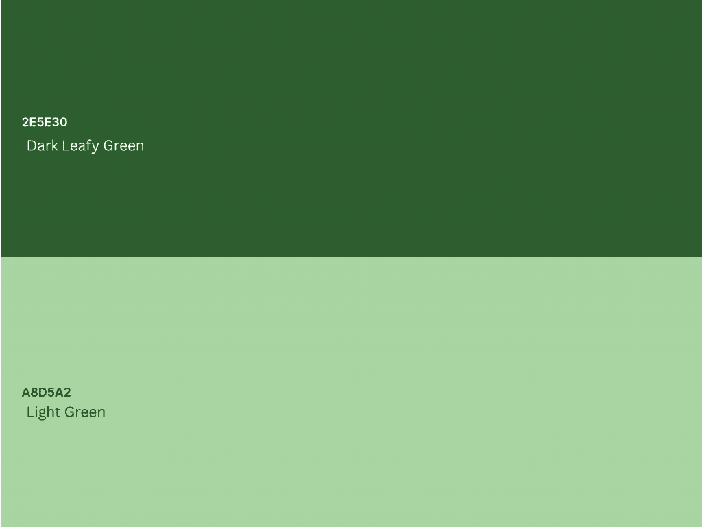
Colour Palette
The palette focuses on calming and grounded shades of green:
- Dark (Leafy) Green – Stability, trust, and wisdom
- Light Green – Renewal, growth, and energy
These colours create a soothing yet strong presence, evoking nature and nurture, an ideal representation of personal development through guidance.
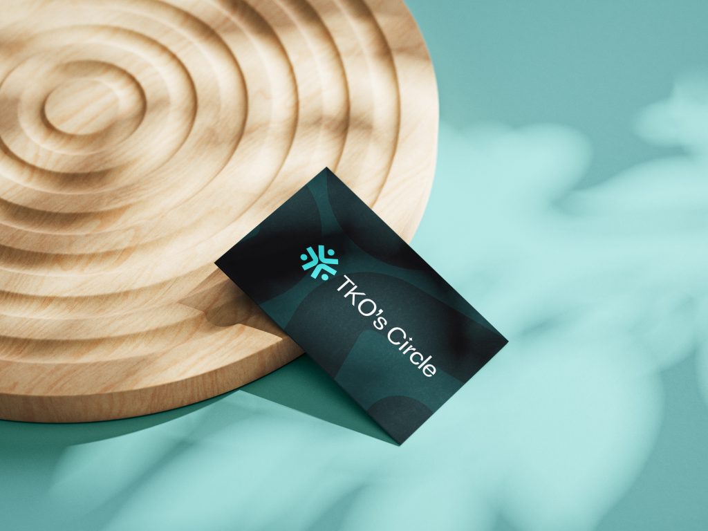
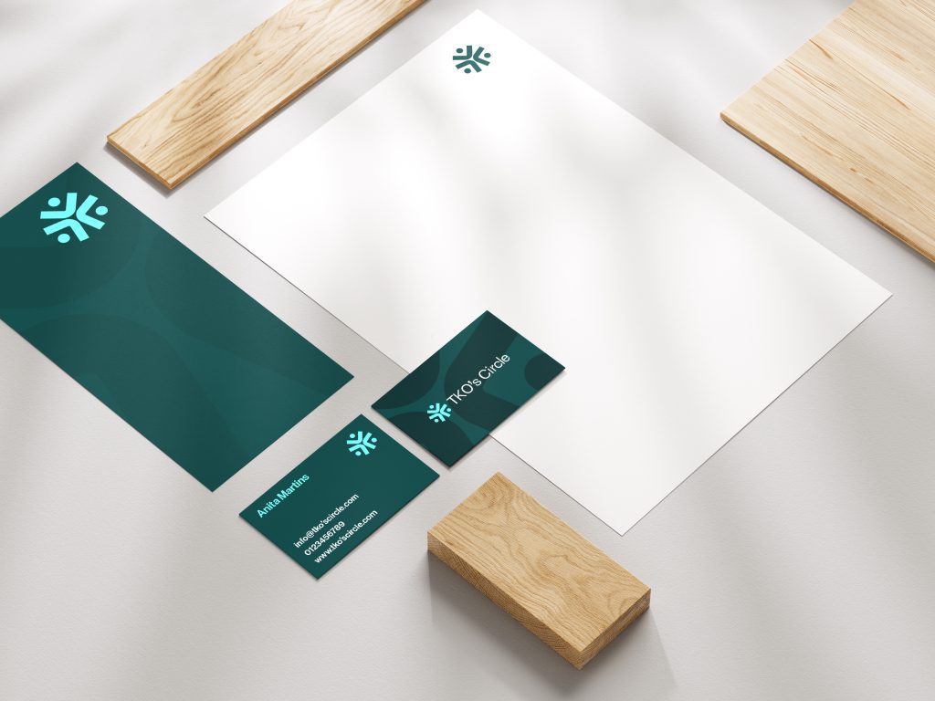
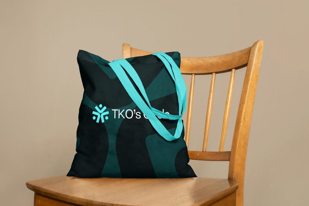
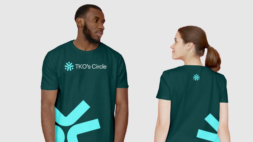
Application & Versatility
The final logo suite includes:
- Primary Logo: Wordmark with symbol
- Secondary Mark: Standalone icon for use in tight spaces
- Monochrome Variants: For maximum versatility on different materials and backgrounds
Application & Versatility
- Business Cards & Stationery – projecting professionalism with warmth
- Tote Bags & Mugs – inviting brand engagement in everyday routines
- T-Shirts & Apparel – transforming community members into brand advocates
- Digital & Social – delivering a clean, confident aesthetic across platforms
Conclusion
The TKO’s Circle logo is a symbol of belonging and empowerment. Rooted in simplicity but rich with meaning, it mirrors the very journey the brand supports: elegant transformation through guidance and connection.
This visual identity now equips TKO’s Circle to expand its presence confidently, inspire more women, and continue building the powerful community at its core, one circle at a time.
Get our quality content delivered to keep up to your inbox
Get inspired and stay informed! Join our community of design and branding enthusiasts, and get fresh content, design tips, and exclusive updates sent directly to your inbox.