Designkroo – Best Subscription Design Services for Entrepreneurs, Brands and Small Businesses
Meridian
Wellness
Sector
Wellness
Year
2025
Overview
Meridian Wellness—formerly known as BalanceTrack—embarked on a transformative rebrand to match the evolution of its product and philosophy. What began as a basic fitness tracking tool is now a robust, integrated wellness ecosystem, offering features that span from physical activity tracking to mental wellness exercises, nutrition planning, sleep analysis, and a vibrant community component. The rebrand’s goal was to reposition Meridian as a premium, holistic wellness solution: not just another fitness app, but a lifestyle companion grounded in balance and intention.
Brand Background
With the new identity came a fresh name: Meridian Wellness, inspired by the idea of balance, flow, and interconnected pathways within the body and mind. The new tagline, “Harmony in Motion,” reflects the app’s dynamic, yet grounded approach to well-being, where every user journey is personal, flowing, and thoughtfully supported.
Meridian’s mission is to empower individuals to achieve balance in physical, mental, and emotional health through intuitive technology and personalised guidance. Its vision is to become the go-to wellness platform that seamlessly integrates every aspect of a healthy life.
The brand is built on five core values:
- Holistic Health: Supporting full-spectrum well-being
- Accessibility: Wellness for all, anytime, anywhere
- Personalisation: Adapting to each user’s unique goals
- Scientific Approach: Rooted in research and evidence
- Community: Encouraging connection and shared progress
Design Process and Concept Development
To match Meridian’s expanded capabilities and values, the new visual identity needed to express serenity, intelligence, and forward motion, while remaining approachable and inclusive.
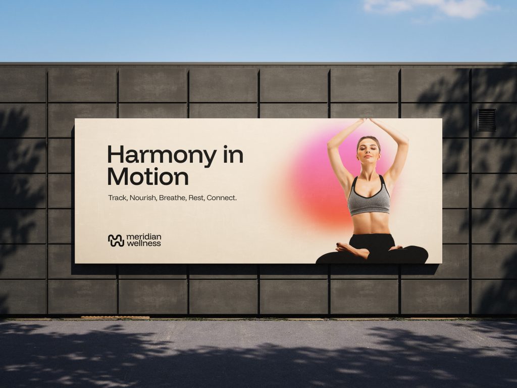
Logo & Imagery Direction
The new visual system incorporates fluid motion, organic shapes, and balanced asymmetry—visually representing the non-linear, evolving nature of well-being. Soft gradients and rounded elements give a sense of warmth and movement, creating a visual experience that is both dynamic and calm.
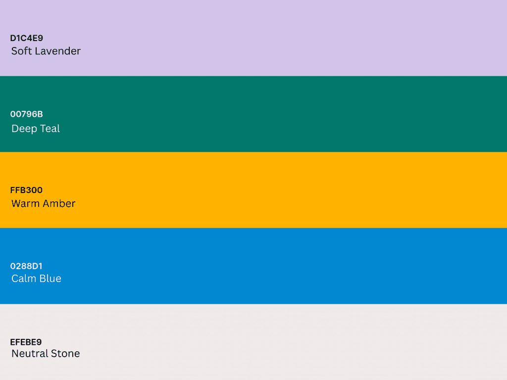
Color Palette
- Soft Lavender (#D1C4E9): emotional wellness and mental clarity
- Deep Teal (#00796B): stability, grounding, and health
- Warm Amber (#FFB300): optimism, energy, and vitality
- Calm Blue (#0288D1): trust, calm, and clarity
- Neutral Stone (#EFEBE9): natural balance and simplicity
Typography

Integrating Brand Voice and Visual Identity
Meridian Wellness speaks in a tone that is encouraging, informed, and calm. Whether guiding users through a breathing exercise or presenting a weekly activity summary, the messaging is gentle yet confident, never overwhelming, always empowering.
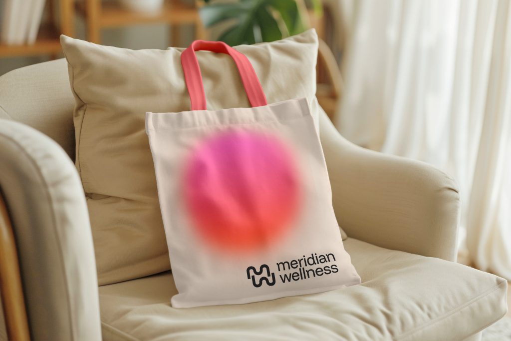
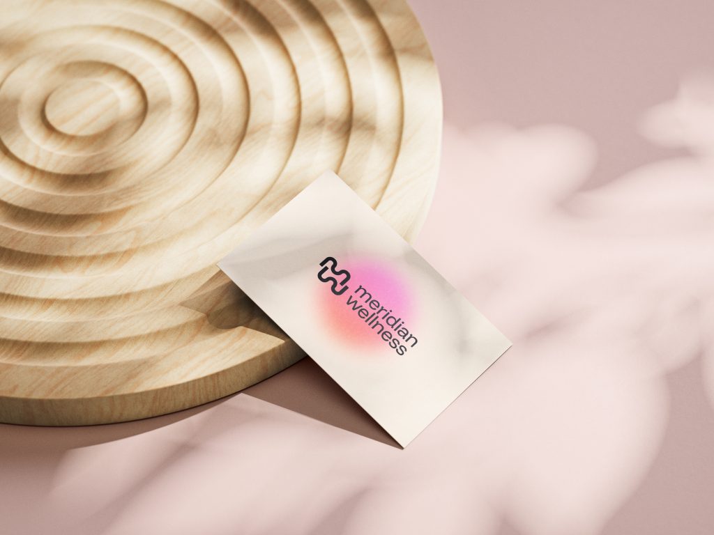
Visuals are kept clean, with soft gradients and layered textures evoking the natural ebb and flow of health journeys. The interface design and marketing assets use fluid animations and subtle interactions to bring the brand’s tagline, Harmony in Motion to life.
Conclusion
The rebrand of Meridian Wellness signals more than just a name change, it marks a new chapter in what tech-enabled well-being can look like. Through a thoughtful blend of fluid design, personalised functionality, and a commitment to holistic living, Meridian now stands as a comprehensive, intuitive, and trusted wellness companion.
The new identity reaffirms Meridian’s place at the forefront of wellness technology, supporting individuals and communities on their paths to balanced, meaningful lives. In motion, and in harmony.
Get our quality content delivered to keep up to your inbox
Get inspired and stay informed! Join our community of design and branding enthusiasts, and get fresh content, design tips, and exclusive updates sent directly to your inbox.

