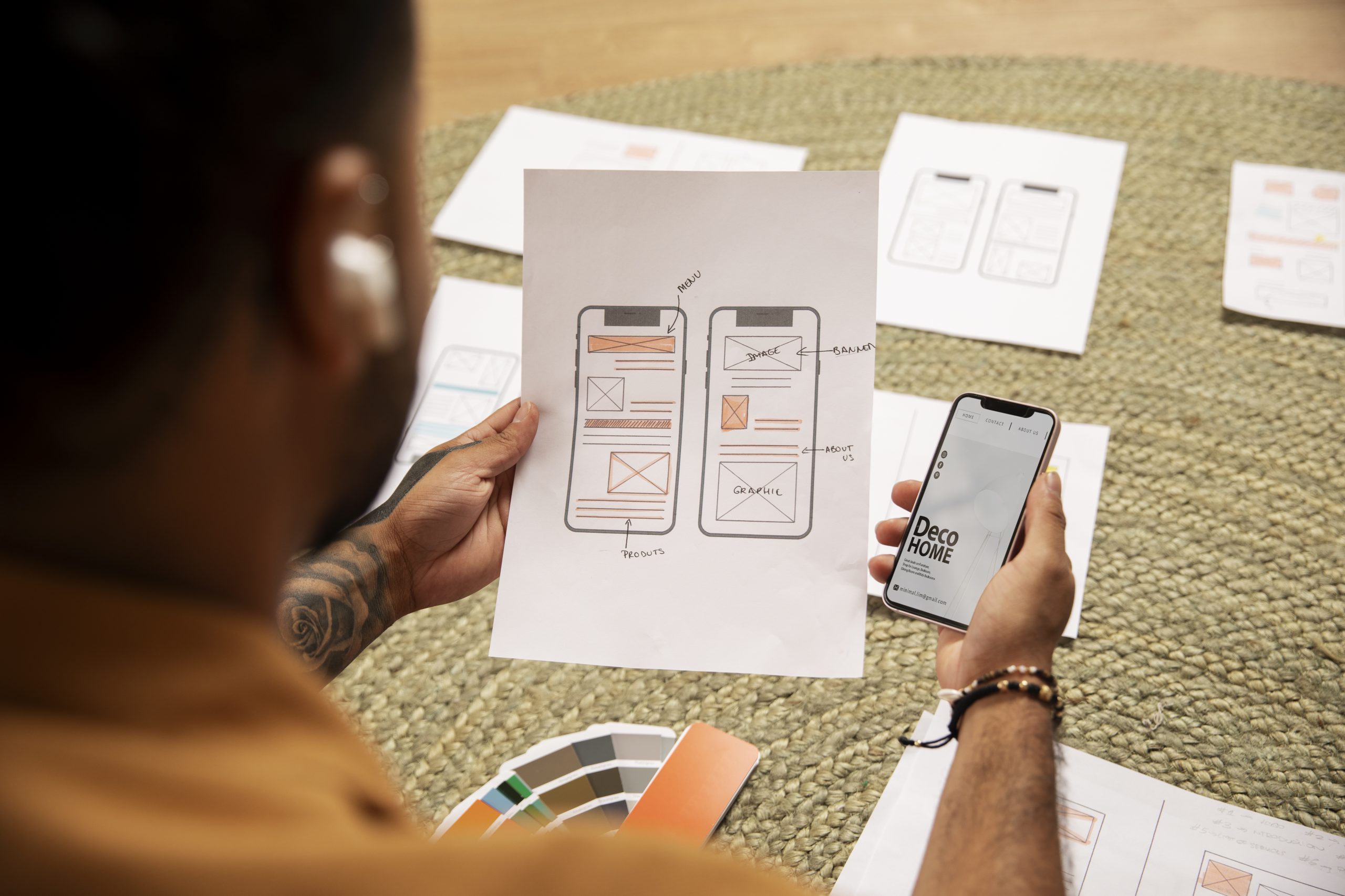
Today, mobile devices account for more than half of global internet traffic so creating responsive designs for mobile platforms is no longer optional — it’s a necessity. Responsive design ensures that your website or application looks and functions perfectly on any device, providing a seamless user experience whether on a desktop, tablet, or smartphone.
At Designkroo, we specialise in creating graphic designs for that captivate and engage users across all platforms. Today, we’re sharing a comprehensive guide on how to create responsive designs for mobile platforms. Enjoy!
1. Understand the Basics of Responsive Design
Responsive design is an approach to web development that renders web pages well on various devices and window or screen sizes. This is achieved through flexible grids, layouts, images, and CSS media queries. The goal is to ensure that your website or app provides an optimal viewing experience — easy reading and navigation with minimum resizing, panning, and scrolling — across a wide range of devices.
2. Adopt a Mobile-First Approach
Designing for mobile first means starting your design process with the smallest screen size and then progressively enhancing the experience for larger screens. This approach ensures that the core functionality and content are prioritised for mobile users, who often face more constraints such as smaller screens and slower connections. By focusing on the essentials first, you create a strong foundation that can be built upon for larger devices.
3. Utilize Flexible Grid Layouts
Flexible grid layouts are crucial for responsive design. Instead of using fixed-width layouts, use relative units like percentages for widths and em or rem for font sizes. This allows your layout to adapt to different screen sizes and orientations. CSS frameworks like Bootstrap and Foundation offer pre-designed responsive grid systems that can simplify this process.
4. Implement CSS Media Queries
CSS media queries enable you to apply different styles for different screen sizes and resolutions. By defining breakpoints, you can customise the layout, font sizes, and other design elements to ensure they look and function well on various devices. Common breakpoints include:
- Small devices (phones): up to 600px
- Medium devices (tablets): 601px to 1024px
- Large devices (desktops): 1025px and up
Here’s a basic example of a media query:
5. Optimize Images and Media
Images and media files can significantly impact the performance of your website or app, especially on mobile devices. Use responsive images that automatically adjust to different screen sizes by using the srcset attribute in the <img> tag. Also, compress images and use modern formats like WebP to reduce file sizes without compromising quality. For videos, consider using HTML5 video elements and ensure they are responsive.
6. Prioritize Touch-Friendly Design
Mobile users interact with devices differently than desktop users, primarily using touch gestures. Ensure that your design is touch-friendly by incorporating the following practices:
- Use larger buttons and touch targets (at least 44px by 44px).
- Maintain adequate spacing between touch elements to prevent accidental taps.
- Implement swipe gestures for navigation where appropriate.
7. Simplify Navigation
Navigation can be challenging on smaller screens, so it’s essential to simplify it for mobile users. Use a hamburger or collapsible menu to save space and keep the interface clean. Ensure that the navigation is easily accessible and intuitive, allowing users to find what they need quickly.
8. Optimize Typography for Readability
Readability is crucial on mobile devices, where screen sizes are limited. Choose legible fonts and maintain a minimum font size of 16px to ensure text is readable without zooming. Adjust line height and spacing to enhance readability and avoid crowding.
9. Test on Multiple Devices
Testing is a vital part of the responsive design process. Test your design on various devices and screen sizes to identify and fix any issues. Use browser developer tools to simulate different devices and screen sizes, and consider using third-party tools like BrowserStack for more extensive testing.
10. Leverage Mobile-Specific Features
Take advantage of mobile-specific features such as geolocation, touch ID, and push notifications to enhance the user experience. By incorporating these features, you can create more engaging and interactive mobile experiences that leverage the full capabilities of the device.
In conclusion, Creating responsive designs for mobile platforms requires a thoughtful and strategic approach. By adopting a mobile-first mindset, utilising flexible grid layouts, implementing CSS media queries, optimising images, prioritising touch-friendly design, simplifying navigation, optimising typography, and thoroughly testing across multiple devices, you can ensure that your website or application provides an exceptional user experience on any device.


