Designkroo – Best Subscription Design Services for Entrepreneurs, Brands and Small Businesses
EcoVision
Sector
Electronics
Year
2025
Overview
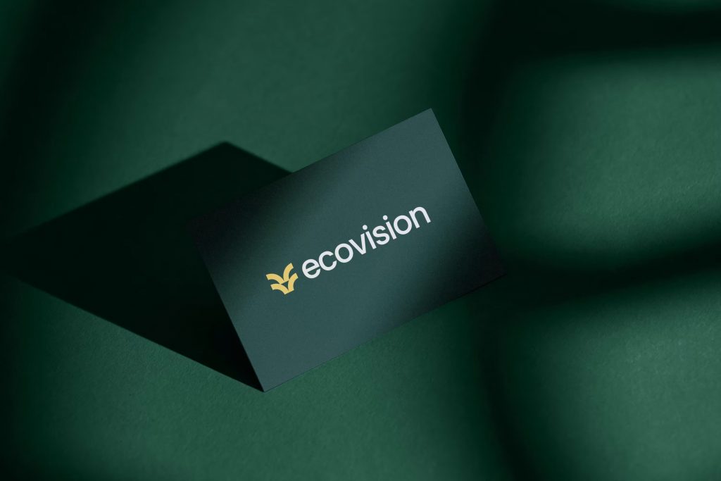
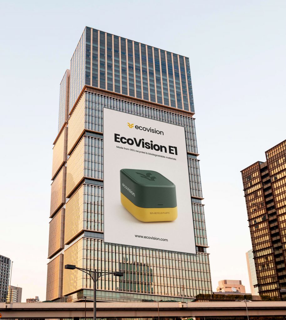
EcoVision, a pioneering brand in sustainable consumer electronics, set out to redefine what eco-conscious technology could look and feel like. With a bold mission to merge environmental responsibility with high-performance design, EcoVision needed a brand identity that spoke to both innovation and integrity. The launch of their flagship product, the EcoVision E1, the world’s first fully sustainable smart home hub.
This marked the perfect moment to establish a compelling visual and strategic brand narrative.
Brand Background
EcoVision exists at the intersection of technology and nature. With a tagline, “Technology in Harmony with Nature,” the company’s vision is to lead the consumer electronics industry in sustainability while delivering seamless, forward-thinking user experiences.
Its core values: sustainability, innovation, transparency, quality, and responsibility, form the backbone of its business and branding decisions. These are reflected in the product design, materials, supply chains, and how the brand communicates with its audience.
The EcoVision E1 is a culmination of this ethos. Constructed from 95% recycled and biodegradable materials, the smart home hub integrates effortlessly with popular smart systems while introducing unique features like energy-saving automation and a carbon footprint tracker, reinventing the role of home technology in a greener world.
Target Audience
The brand speaks to a growing community of mindful tech users:
- Eco-conscious consumers (25–45) who prioritise sustainable products.
- Tech early adopters who are aware of e-waste and value innovation with impact.
- Mindful homeowners investing in long-term smart home solutions.
- Corporate clients improving ESG scores and aiming for greener offices.
Design Process and Concept Development
The creative direction focused on translating EcoVision’s deeply rooted mission into a minimalist, warm, and forward-looking identity that would stand out in both the tech and sustainability spaces.

Color Palette
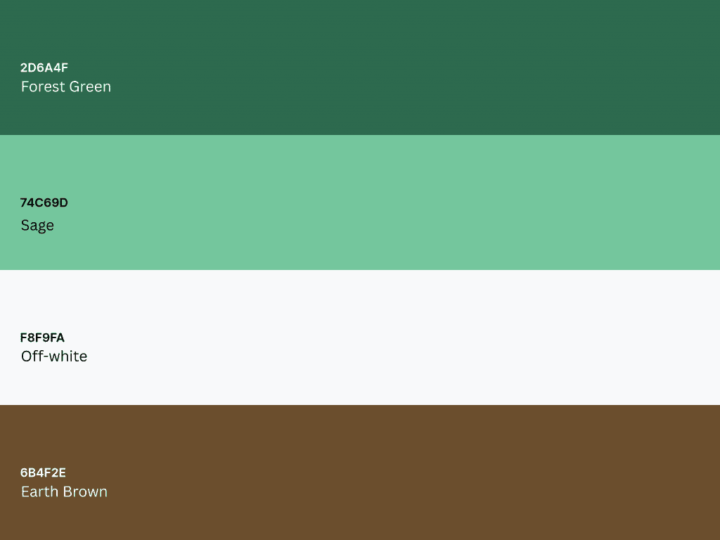
A natural, earth-toned palette reinforces the environmental narrative:
- Forest Green (#2D6A4F): trust, growth, and harmony with nature
- Sage (#74C69D): freshness, innovation, and calm
- Off-white (#F8F9FA): clarity, space, and balance
- Earth Brown (#6B4F2E): grounding, stability, and a nod to raw materials
Typography
- Montserrat is used as the primary font for its modern, legible aesthetic—ideal for packaging and user interface applications.
Merriweather, with its organic, warm serif style, serves as the secondary typeface, lending personality and approachability to headlines and brand storytelling.
Visual Style
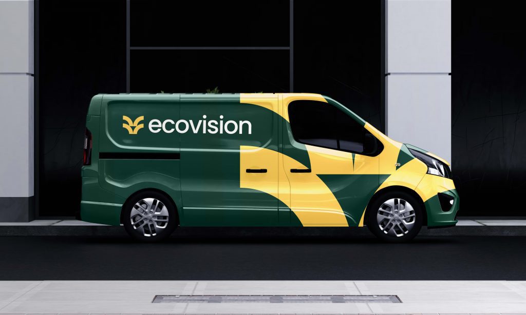
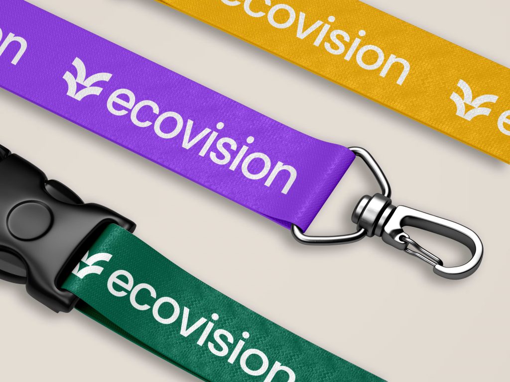
The design embraces organic shapes, smooth curves, and subtle nature-inspired patterns, such as leaf imprints, grain textures, and flowing lines. This reflects the brand’s alignment with natural systems while maintaining a clean, tech-forward feel.
Integrating Brand Voice and Visual Identity
EcoVision’s voice is professional yet warm, striking a balance between innovation and approachability. The visual identity is tailored to communicate confidence without arrogance, and eco-consciousness without compromise.
Brand messaging across packaging, product UI, and digital platforms speaks in a tone that is educational, transparent, and inspiring, empowering users to make smarter, more sustainable tech choices.

Conclusion
EcoVision’s brand identity is more than a logo or a colour scheme—it’s a promise. Through thoughtful use of design elements, EcoVision communicates its dedication to reshaping the future of electronics, one sustainable solution at a time. The brand’s minimalist visual language, combined with warm, earthy tones and nature-inspired textures, reflects a new standard for consumer electronics: smart, beautiful, and built to last, not just in performance, but in purpose.
As EcoVision introduces the E1 and continues to expand, its identity sets the tone for a future where technology doesn’t just fit into our lives, but aligns with our values.
Get our quality content delivered to keep up to your inbox
Get inspired and stay informed! Join our community of design and branding enthusiasts, and get fresh content, design tips, and exclusive updates sent directly to your inbox.

